In short
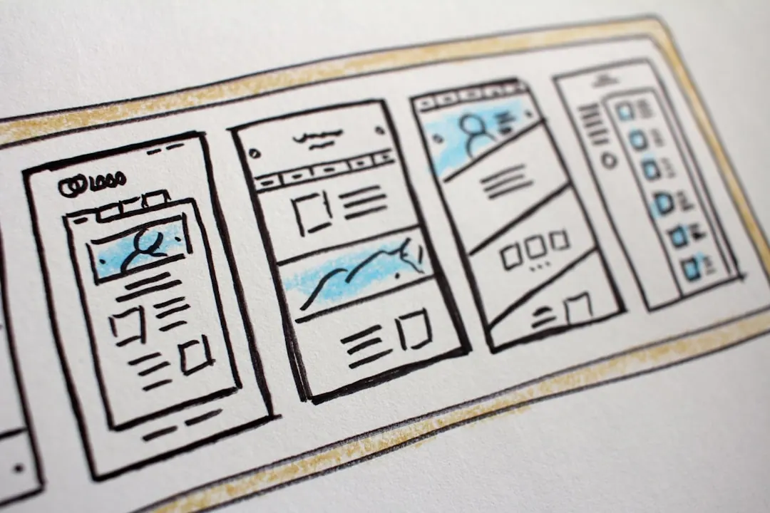
UI covers the screens and controls: layout, typography, buttons, forms, menus, states, and component behavior. It is what the user can see and touch.
UX covers the wider experience: why the user arrived, what they need to complete, what information they need first, how errors are handled, and whether the handoff after the screen works.
Where it bites
This bites when teams treat a conversion problem as a visual refresh. Cleaner cards will not fix unclear pricing, missing proof, broken form logic, or a booking flow that asks for too much too early.
What to check
- Can a new visitor tell what to do next without reading the whole page?
- Does the interface explain, prevent, or recover from the most common user mistakes?
- Which metric proves the UX improved: completion rate, enquiry quality, checkout drop-off, or support load?
Common questions
What is the difference between UI and UX?
UI is the visible interface a person uses. UX is the full experience around the task: intent, flow, clarity, friction, error handling, and the outcome after the click.
Can good UI still have bad UX?
Yes. A page can look polished and still hide the main action, ask for the wrong information, load slowly, or send users into a dead end.
What should you check first in UI vs. UX work?
Start with the task the user came to complete, the points where they drop out, and the evidence they need before acting. Then adjust the interface around that path.